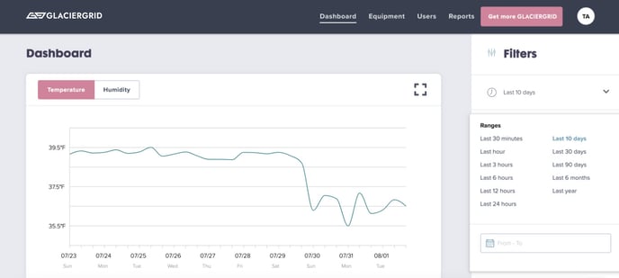
When you log in to the GlacierGrid dashboard, the first page you will encounter is the “dashboard” page. The first visualization on the dashboard page is the temperature graph. Each colored line represents a separate location. The temperature graph allows you to identify spikes and shifts in temperature at a glance.
Can I change the time on the graph from Military time to Regular time?
The GlacierGrid dashboard graph time depends on your device's time format. If your device is set up on 24-hr format, then the time displayed will be on military time. If you wish to change the format to a regular time format then you may change your time setup on your device to update your time to a 12-hr format on your dashboard.
How do I use the Filters?
The dashboard's graph is automatically filtered to a 10 day view for a bird's eye view of your more recent data. To see the most recent data points, update the filter's date range as needed.
You can also use the side bar to search your equipment location name, sensor name, or sensor ID.